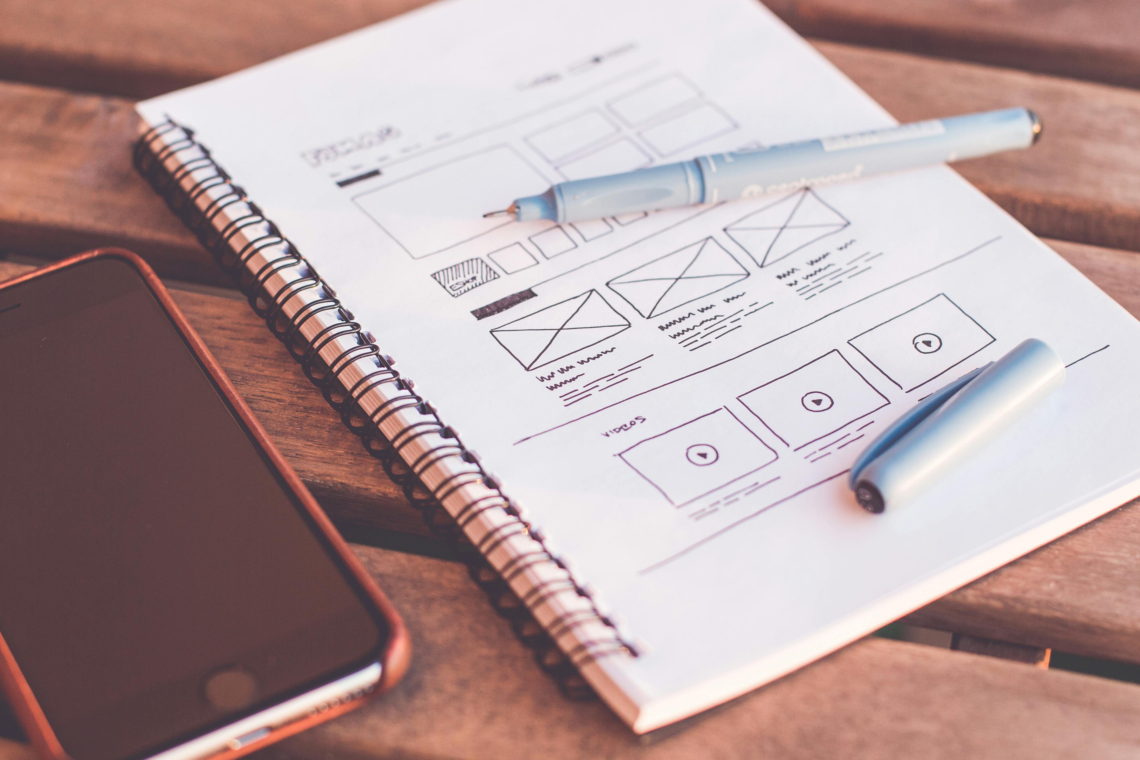
Your website is the face of your company, because that is what people will see. A beautiful website design with easy navigation and shopping procedures will go a long way with helping you to compete with big online retailers.
Take a cue from these bigger retailers by taking a look at how they arrange their websites and how the ordering process works. Look at the good things they offer, but then also what are the struggles with their sites?
Big Retailer Website Design Disadvantage

One of the big disadvantages that a big retailer has in their website design, is that they try to offer as many products as possible. So you will find a huge amount of categories and sub-categories. As well as tons of other search options so you can help to narrow down the millions of products on the site.
Even then, if you are like me, typically give up and get the most like what I was looking for, even after spending days trying to find it! With a smaller more focused site, you can make your navigation even simpler and keep your customers focused on what they should be buying.
Best Website Design: Niche Sites
When your business is focused on a niche, your website design is more focused and ultimately your customers are more focused.
First, figure out the niche you want to sell.
Then use a great Niche store designer platform like Squarespace.
Then, take a look at our 7 Deadly Sins of Online Store Design for some extra tips!
If you aren’t making the sales that you hope to, but you are getting traffic, website design should be one of the first things to look at and improve upon. So always go back and make changes and adjustments to your site based on your customer feedback and site metrics.


Unfortunately a lot of people don’t know what’s involved in creating a good website, especially one that actually makes money! They think they can cheap out and they end up spending more in the end anyway!