When you create a beautiful and easy-to-navigate online retail store, customers keep coming back to you for the experience! A well-designed store not only attracts new customers but also builds loyalty among existing ones. The visual appeal and user-friendliness of your site play a crucial role in shaping the overall shopping experience.
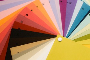
Over the course of the next few months, we will delve into the 7 Deadly Sins of Site Design, starting with Store Design Color Choices. Color is a powerful tool in design; it can evoke emotions, influence perceptions, and even drive purchasing decisions. Choosing the right color palette for your store is essential to creating a cohesive and inviting atmosphere.
Deadly Sin #1: Store Design Color Choices
Choosing the right color theme for your site is crucial. It’s not just about picking your favorite color—what looks good to you might not appeal to others or work well online.
Stay Current with Trends: Select colors that are trending and visually appealing. A quick search for “This Years Color Trends” can show you what’s popular each year.
Match Your Products: Consider the products you’re selling. For relaxation and meditation items, opt for soothing, calm colors instead of jarring ones like black or bright red. For sports equipment, choose vibrant, playful colors.
Complementary Colors: After selecting your main color, pick complementary shades for sub-menus and other graphic elements. Toning down your main color or choosing a lighter or darker shade often works best. Here is where the color wheel can play an important part! You will find complementary colors you might not have considered.
Set the Mood: Colors set the mood and tone of your site, playing a crucial role in how visitors perceive and interact with your online store. The right color scheme can evoke specific emotions and create a welcoming atmosphere that aligns with your brand’s identity.
Color Psychology: Did you know that orange signifies optimism, yellow is cheerful, and blue represents trust and peace? Understanding color psychology can help you make informed decisions. Colors have meanings, and many shoppers will leave a site immediately if the color isn’t pleasing or gives the wrong impression. Google “Color Psychology” to learn more about how different colors can influence perceptions and behaviors.
Have you ever seen a poor color choice for an online store? Share your comments below!


